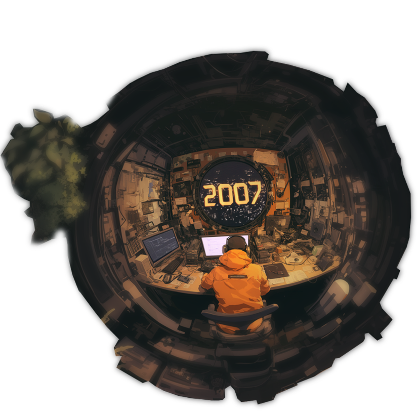
We Have Been Around Since 2007, But We Take It a Day at a Time
Even though we've been around since 2007, no machine is built to last forever. We aim to make the best of our time with the hope to build a legacy that future generations can build upon.
We Have Been Around Since 2007, But We Take It a Day at a Time
Even though we've been around since 2007, no machine is built to last forever. We aim to make the best of our time with the hope to build a legacy that future generations can build upon.

Small Yet Global In Reach
Our team may be small but we are global - with members from Singapore, Myanmar, and Bhutan.
We believe that by fostering diversity and inclusivity we will truly be able to fulfils our vision. The world is an oyster, where each person is a pearl in their own right. Everyone has something to share, we all can learn from one another.
Our Values and Beliefs
Treat Others How You Want To Be Treated
The core and possibly the only guideline that the team must adhere to. It is the first principle that fosters respect, trust, and harmony, ensuring everyone feels valued and heard.
We Care About The Right Stuff
We do not chase external things like awards, or recognition. We place greater value on the right stuff, our grit, our beliefs, and in helping others.
Fortune Favours The Prepared
Preparation means anticipating trends, adapting to change, and acting decisively. Thinking ahead ensures we shape what’s to come.
The Story Behind Our Logo
The Story Behind Our Logo
A Blend of Cultures and Prosperity
At Refruit, we have always embraced the blend of creativity and meaningful connections. As our journey led us to gain more clients across Asia, particularly from the Chinese community, we sought an identity that resonates universally while honouring cultural roots. This inspired the creation of our logo, a symbol that marries our name, Refruit, with its Chinese counterpart, 瑞福, harmonising both sound and significance. The bat symbolizes fortune and happiness in Chinese culture (蝙蝠, "Bian Fu"), as "Fu/福" also means prosperity. Holding a fruit, the bat represents abundance and growth, aligning with our mission to deliver fruitful results. Its flight signifies progress and our drive to reach new heights for our clients. Our logo is more than a design; it is a story. It reflects our journey, our multicultural connections, and our aspiration to bring blessings and success to every partnership we forge.

We are Here to Help
We are Here to Help
We’re remote-first — with strategic hubs in Asia
Singapore
Myanmar
Bhutan
Thailand
This allows us to bring global perspectives and local expertise to every project.